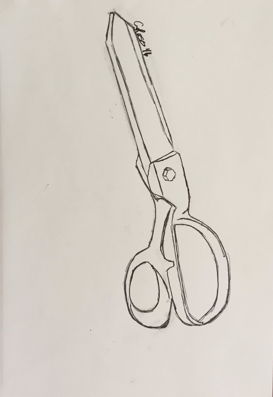
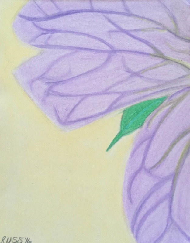
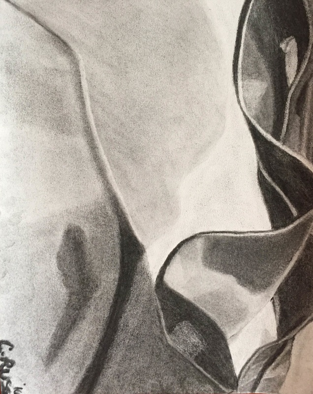
Summer Artwork
My Artist Heroes
Tony Moore
Michael Anthony Moore (a.k.a. Tony Moore) is a comic book and graphic novel penciller, inker, and colorist. He is most noted for illustrating the first six issues of The Walking Dead comic book series, founded by himself, Robert Kirkman, and Charlie Adlard. He has also illustrated for The Exterminators and Fear Agent series. Moore has received many award nominations regarding his work for The Walking Dead, even though he left after six issues. Moore often likes to use black and white in his work, but occasionally switches to color. The value of Tony's work has skyrocketed since The Walking Dead was made into a hit television show on AMC in 2010.
Michael Anthony Moore (a.k.a. Tony Moore) is a comic book and graphic novel penciller, inker, and colorist. He is most noted for illustrating the first six issues of The Walking Dead comic book series, founded by himself, Robert Kirkman, and Charlie Adlard. He has also illustrated for The Exterminators and Fear Agent series. Moore has received many award nominations regarding his work for The Walking Dead, even though he left after six issues. Moore often likes to use black and white in his work, but occasionally switches to color. The value of Tony's work has skyrocketed since The Walking Dead was made into a hit television show on AMC in 2010.
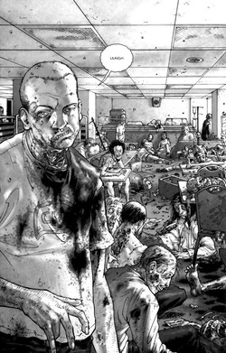
Tony Moore drew this for the first issue of The Walking Dead in 2003. It was drawn using black ink and some water-based pens. This panel in the comic book took up a full page. The picture is of several zombies inside a hospital cafeteria, where the main character of the comic had waken up. The drawing was made additive, however it is supposed to look subtractive.
The elements of design that pertain to this piece are shape, texture, space, form, and value. Shape pertains to this illustration because of the thickness of the lines in it. The zombie in the front is shown to be in the front because the line separating it from the rest of the image is thicker than the others. Texture pertains to this piece because of the wrinkles and indentations in the zombies' faces. Space pertains to the drawing because of the clear usage of shadows and highlights in the picture, as well as some objects appearing to be strewn about the room, appearing to be on top of each other. Form also pertains to the illustration because of the shadows on the faces and clothes of the zombies. Value can also pertain to this drawing because of the many different tints of blacks and greys in the picture. The principles of design that pertain to this drawing are asymmetrical balance, emphasis, and contrast. The balance of the design is asymmetrical because there is no reflection portrayed in the drawing. Emphasis pertains to this drawing because one zombie is perceived to be more important than the rest because it is in front of all of the others and coming towards us. Contrast also pertains to this picture because one of the zombies is active while the others are just sitting there.
When I look at this piece i feel a bit repelled, obviously because one of the zombies is looking at the viewer. The mood of the work, however, is more sad than scary because of the blood and corpses lying around like it is nothing. Th drawing partly tells a story (because it is just one part of a comic book) in the fact that a hospital has been infiltrated by zombies, seen by things that have most likely been trampled. Because of the zombies, the piece is non-objective. The response the piece evokes is memories of where the zombies were when they were alive.
I like the picture. I'm glad that the illustrator did not put too many zombies in it to create too little contrast and too much similarity in the drawing. I do not think that the piece itself should be a piece in art history, but I think that the comic series in general is highly recognized for the beginning artwork. The piece has had and influence on others work including the current illustrators of the comic series, such as Charlie Adlard, Cliff Rathburn, and Stefano Gaudiano, all trying to replicate as best as possible Moore's black and white strategies. I think that this drawing in the comics is also a great representation of what happens for the rest of the series.
Chris King
Chris King is a comic character design illustrator and animator. He also enjoys fine art, painting, sculpting, film-making, and photography.
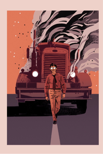
Chris King illustrated this picture from Duel, a television movie from 1971. The movie is about a man being chased by a maniac in a massive tractor trailer on a desert highway. The picture was most likely drawn using paint or maybe even computer graphics. The size of the drawing is 180x265mm, and was made for a book honoring famous movies. The drawing was made additive. The person in the picture is the man from the movie being chased by the crazed driver. He is walking because in the film, the man struggled to stand up for himself.
The elements of design that pertain to this piece are line, color, shape, space, and form. Line pertains to this piece because of the dividing line in the middle of the road leading viewers' eyes up to the subject. Color pertains to this drawing because the use of all the different shades of red, a color that is usually associated with heat or danger, creates a consistent picture and also separates the man and the truck using slightly different shades on the two subjects. Shape pertains to the drawing because of the difference of color between the man and the truck. Texture does not completely pertain to this piece, but it can be said that it does in the man's shirt or on some parts of the truck. Space pertains to this piece because of the difference of colors between the man and the truck and also because of the line in the road, again, telling viewers how far away the subject is. Form pertains to this piece because the truck is clearly three-dimensional by looking at the trucks nose in comparison to the truck's windows using the locations of the dark shadows on it. The principles of design that pertain to this piece are unity, radial balance, emphasis, and rhythm. Unity pertains to this piece because of the repeated use of red, extending road line, and building exhaust from the truck. There is a radial balance because the two subjects are in the center of the picture with smoke and asphalt surrounding them. Emphasis pertains to this drawing because of the difference of color between the truck and the man. The man is clearly in front of the truck because of this. Rhythm also pertains to this piece because of the repeating colors and mutual positions of the man and the truck. The man is also in front of the truck creating a focal point interruption.
When I look at the piece I feel afraid for the man who is walking in front of the truck. The mood of the work is supposed to be sad because the man cannot stand up for himself in the movie, therefore he is not taking action against the truck. This is the story it tells also. This piece is mostly abstract because of the vibrant colors being so exaggerated. The response this piece evokes is self-doubt, because of the man's low self-reliance skills against the truck driver. The artists purpose for creating the piece was not only for the movie art book, but because he enjoyed the movie himself.
I like the piece. I like this piece because of the use of red to signal danger and bring out the heat of the desert. I don't think it should be a piece in art history because the movie isn't really well known, but I do believe that it is a good piece and looking at all the other pieces by King, this is my favorite. King also isn't really well known, so he hasn't influenced many people, but he has illustrated many books and has definitely influenced a handful of other unknown artists. The title of the movie is also very well explained in this piece, because in this piece there is clearly a duel between the man and the truck.
Andy Warhol
Andy Warhol, born Andrew Warhola (1928-1987), was an American artist who led the pop art movement. He began his career using ink and moved into print-making, a technique used with paint. He began showing his work in New York City and Los Angeles in the 1950s. Later on in his painting career, he usually focused on 1960s advertising, expressions, and celebrities. He drew the likes of Elvis Presley, Muhammad Ali, and Marilyn Monroe. His art continues to be recognized worldwide. He is a large piece in modern art history.
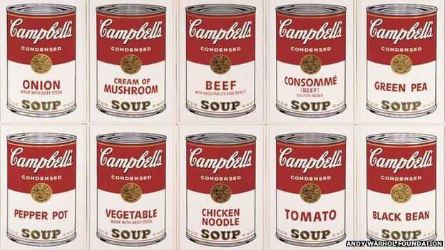
therpop art Andy Warhol painted this picture, entitled "Campbell's Soup" in 1962. He used synthetic polymer paint on canvas. Each can is on an individual canvas, each 20x16 inches. There are a total of 32 soup cans in the work, to create one giant mural. There is no specific setting of the piece, but most of Warhol's work on everyday items were assumed to be in the everyday home. The painting was drawn additive. What is most interesting about this work is that Warhol made sure to include every kind of soup that Campbell's sold at the time. It is one of his most well-known works.
The elements of design that pertain to this piece are color, texture, form, and value. Color pertains to this piece because of the red and golden yellow, which continually change shades as the canvas's progress. Texture pertains to this painting because of the peaks of the individual rims on top of the soup cans. Warhol also implies the smoothness of the wraps on the individual cans. Form pertains to this piece because each can is three-dimensional. Value also pertains to this because of the black added to the top and bottom rims of each can to help create their textures. The principles of design that pertain to this painting are unity, variety, symmetrical balance, harmony, and rhythm. Unity and variety pertain to this piece each can is the same, except for the soup category, and none of the 32 of them are seen as the most important. The same could be said for harmony. There is also a symmetrical balance because the cans on the canvases create a grid. Rhythm can also pertain to this piece because of the repeating positions, size, and colors of the soup cans.
When I look at this piece, I feel amused because there are so many ridiculous types of Campbell's soup. I think that the mood of this work is supposed to be funny because of the numerous soup cans. I also think that the drawing tells the story of Campbell's soup and how they have continuously been adding new soups to their line. This makes the piece more on the realistic side of pop art because of the true representation of the soup cans and their colors and labels. This piece also evokes a response of everyday life. Viewers are supposed to look at this piece and recognize their favorite soups that they probably buy at the supermarket. I also think that the piece evokes a sense of boredom or of doing the same thing over and over again. Warhol said that he painted this because everyday for 20 years at work he would just eat the same thing- Campbell's soup, and that it got very boring, so he painted out his feelings.
I like this piece. I like this piece because of the sense of repetition and the size of the paintings. They take up a whole wall in a museum. It is an important piece in art history because it is when Warhol started his photo-silkscreen process of painting, which revolutionized pop art and therefore art in general. It is also very well recognized because it is the biggest example of Warhol's strategy of repetition in his paintings, because of the shear size of the canvases together. This is one of Warhol's most famous pieces and it has had an influence on many young artists including Jean-Michel Bisquiat, Julian Schnabel, and David Salle, who were considered part of the new and related movement of Neo-Expressionism. He has also influenced the Transavantgarde movement in Europe, which included Francesco Clemente and Enzo Cucchi. The title of this piece ("Campbell's Soup") does make sense simply because the 32 cans are all different types of Campbell's soup.
Concentration Draft
My concentration focuses on horror/fantasy drawings mixed with reality. I used ink, alcohol markers, and Photoshop. My concentration demonstrates my investigation of reality and fantasy by having recognizable places such as cities around the world in the background of my illustrations combined with different creatures and objects from horror and fantasy genres in the foreground. I made it look as if the creatures have taken over said places or are somehow just visiting.
Reality and fantasy are juxtaposed with aliens, zombies and dinosaurs in famous places like New York, Las Vegas, and Chicago in my work. In image 2, I used the alcohol markers to draw the foreground and add an element of realism in my images. For this one, it was the sweatshirt and pumpkin head. I blended the markers together to create contrast and realism. I next scanned the image and in Photoshop created the background that I thought would fit the image. For this one it was the arch in St. Louis. I used this location because I thought it framed the head nicely. The background was, as always, made of solid colors. In image 1, I switched to using only Photoshop. I used ink to draw out the image and then scanned it into photoshop, where I used the paint bucket tool, filter tool, and gradient tools to create on entirely digital image for my concentration set. In Image 7, after I went back to using both mediums and started putting multiple pictures in one concentration, I drew everything out with the ink and markers like before, and created a simpler background to go with my only black and white images. To make them unified with the series, I used a blood spatter brush in strategic places throughout the images. An example of this is the one behind the statue (slide 7) and my personal favorite use of the brush tool in the series.
Reality and fantasy are juxtaposed with aliens, zombies and dinosaurs in famous places like New York, Las Vegas, and Chicago in my work. In image 2, I used the alcohol markers to draw the foreground and add an element of realism in my images. For this one, it was the sweatshirt and pumpkin head. I blended the markers together to create contrast and realism. I next scanned the image and in Photoshop created the background that I thought would fit the image. For this one it was the arch in St. Louis. I used this location because I thought it framed the head nicely. The background was, as always, made of solid colors. In image 1, I switched to using only Photoshop. I used ink to draw out the image and then scanned it into photoshop, where I used the paint bucket tool, filter tool, and gradient tools to create on entirely digital image for my concentration set. In Image 7, after I went back to using both mediums and started putting multiple pictures in one concentration, I drew everything out with the ink and markers like before, and created a simpler background to go with my only black and white images. To make them unified with the series, I used a blood spatter brush in strategic places throughout the images. An example of this is the one behind the statue (slide 7) and my personal favorite use of the brush tool in the series.
